POSED2
Overview
WHAT IS THE PRODUCT?
Posed2 is a web app that provides students with college to career guidance using games and AI. First, Posed2's game platform captures micro behavioral data from game play. A profile of the player is then created highlighting career critical strengths. Last, Posed2's analytics use those insights to predict a small number of career fits to the user.
PROJECT DURATION & TIMELINE
GOALS OF UX SPRINT
HOW WILL SUCESS BE DEFINED FOR THIS PRODUCT?
Produce a web-app that provides high school students with a fun way to learn about potential career paths using Posed2.
1) Create a consistent game-like and interactive experience for the user from beginning to end.
2) Present information such as personality strengths and careers to high school students in a way that is both informative and enjoyable.
RESPONSIBILITIES
Competitive analysis, user interviews, usability testing, paper prototypes, wireframes, visual design, interactive prototypes.
Research
01 FEATURE & COMPETITIVE ANALYSIS
To supplement user research, I conducted market research focusing on Posed2's competitors. Data generated includes market trends and demographics. Additionally, I focused on various gamification principles that were used. Two areas of improvement that stood out to me were
1) integrating game-like aesthetics and 2) providing clear user goals.

02 HEURISTIC ANALYSIS
I performed a heuristic analysis on Posed2's original wireframes and competitors. Notes were taken on what areas Posed2 can grow in, and what is innovative in comparable businesses.

03 SECONDARY RESEARCH & CONTENT
After extensive research of personality psychology texts, I wrote the content for the personality strengths users would receive upon completion of the games.

Openness
People who are open to new experience are curious and intelligent. They are able to take in information from many different sources and perspectives.

Extraversion
People high in extraversion are assertive and enthusiastic. They are comfortable interacting with others often and for extended periods of time.

Conscientiousness
People high in conscientiousness generally plan ahead and strive to attain their goals. They are orderly and persevere in their objectives.

Agreeableness
People high in agreeableness are cooperative, compassionate, and polite. They are supportive of other people and effective in avoiding conflict.
References:
Digman, J.M., & Inouye, J. (1986) Further Specification of the five robust factors of personality. Journal
of Personality and Social Psychology, 50, 116-123.
McCrae, R. R., & Costa, P. T., Jr. (1989). The structure of interpersonal traits: Wiggins's circumplex and
the five-factor model. Journal Of Personality and Social Psychology, 56, 586-595
User Research
04 RESEARCH GOALS
The intent of the proposed study was to gather qualitative data about the factors that students (ages 15-25) have experienced through his or her career exploration, circumstances at the time, and access to resources. In the second portion of the study, both quantitative data and qualitative data was collected to test high level concepts in usability tests of wireframes.
The focus of the research included:
1) Gaining insight of major pain points for youth as they begin this stage of career development
2) Feedback for product concepts early in the design process such as app flow
05 PARTICIPANTS
15 participants between the ages of 15 and 25 (60% female) were recruited through word of mouth. 73% of participants self-identified as Asian, and 27% self-identified as Caucasian. Participants were given an informed consent form and NDA to sign prior to the interview.
06 METHODS
The survey was conducted face-to-face with tools in place to ensure user answers are completely anonymous. There was no material benefit for this survey.
There were two phases within this interview 1) Users were asked questions about his or her experience with exploring potential careers face to face in exploratory user interviews. If desired, users were given an opportunity to review the recordings and delete any portions.
2) Users went through a usability test and then given a question survey that asks questions about his or her experience before and after completing given tasks with the paper prototypes. The survey was composed of 10 questions. The entire interview lasted between 30-40 minutes. The questions were designed to assess the experiences in different degrees depending on the individual. Example of a question is shown below.

Due to budget and time constraints, I used the same set of participants for both user interviews and usability tests for high level concept paper prototypes.
07 LIMITATIONS
Several limitations of the user research should be noted. The sample population of our study, 15 participants, was relatively small and lacked diversity. All were mostly American-born students between the ages 18 – 25 years old. Limitations also stem from our research design which is non-experimental. Therefore, I am unable to define a causal relationship between the variables. Future research should include a more diverse population, as well as a more in depth examination of the factors that are helpful to users when exploring potential career paths.
Additionally, usability testing as a research method has several drawbacks. During a usability test, the participant's full attention is directed towards the site, while in real world situations, users are often less engaged and simultaneously performing other tasks. As a result, the weaknesses of the site that could potentially occur when the user is less focused would not be noticed during a usability test. Secondly, as the participants are assigned with user tasks and flows to go through, their motivations are not genuine. Users will likely have a different experience of the site and have different behaviors when navigating the system on their own.
Analysis
08 USER JOURNEY
A user journey map was used as a tool to summarize the themes from 15 user interviews conducted with students around the launching and career exploration process.

09 PRIMARY PERSONA

A secondary persona was created to represent low-income, minority, first generation (LIMFG) students. The link to the LIMFG use case is below.
10 USER QUOTE
"This app was confusing in the beginning. I wasn't sure what the difference is between these games and downloading candy crush. How would they know that these careers match my personality from these games?"
Hypothesis
Problem
1. Users are confused about why they are playing the game. What is the goal? What's next?
2. Users lacked trust for the app and questioned its validity.
3. Users found the experience to be tangential and segmented.
4. Users lacked enjoyment while playing.
Solution
-
Give users incentive and goals for using the app
-
Provide rationale behind process
-
Integrate game-like interaction and styling into the beginning and end of experience.
-
Provide users with only critical information while using minimal text.
Features
-
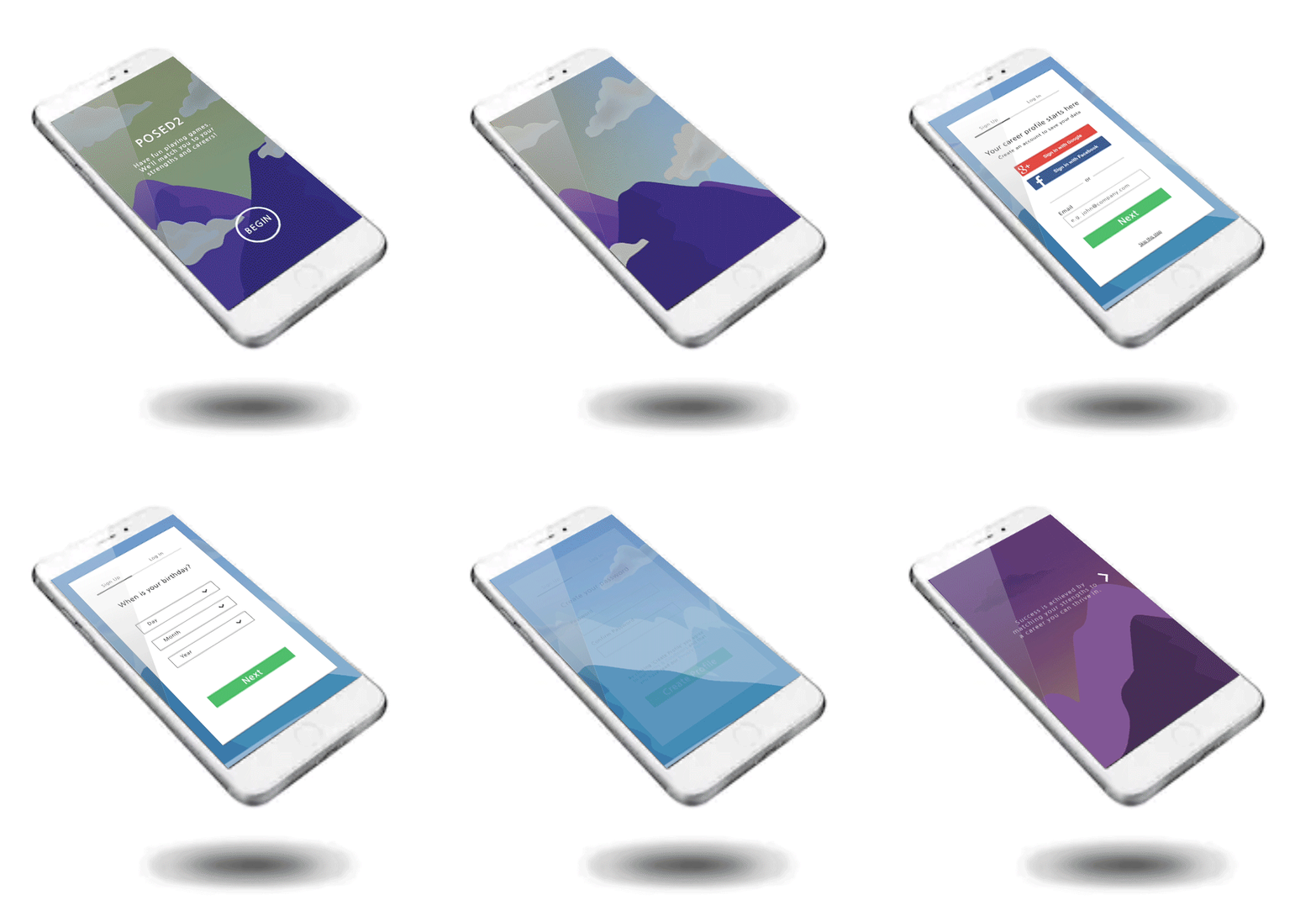
Use parallax scrolling and graphic mountain intro to provide explanation of game and goals.
-
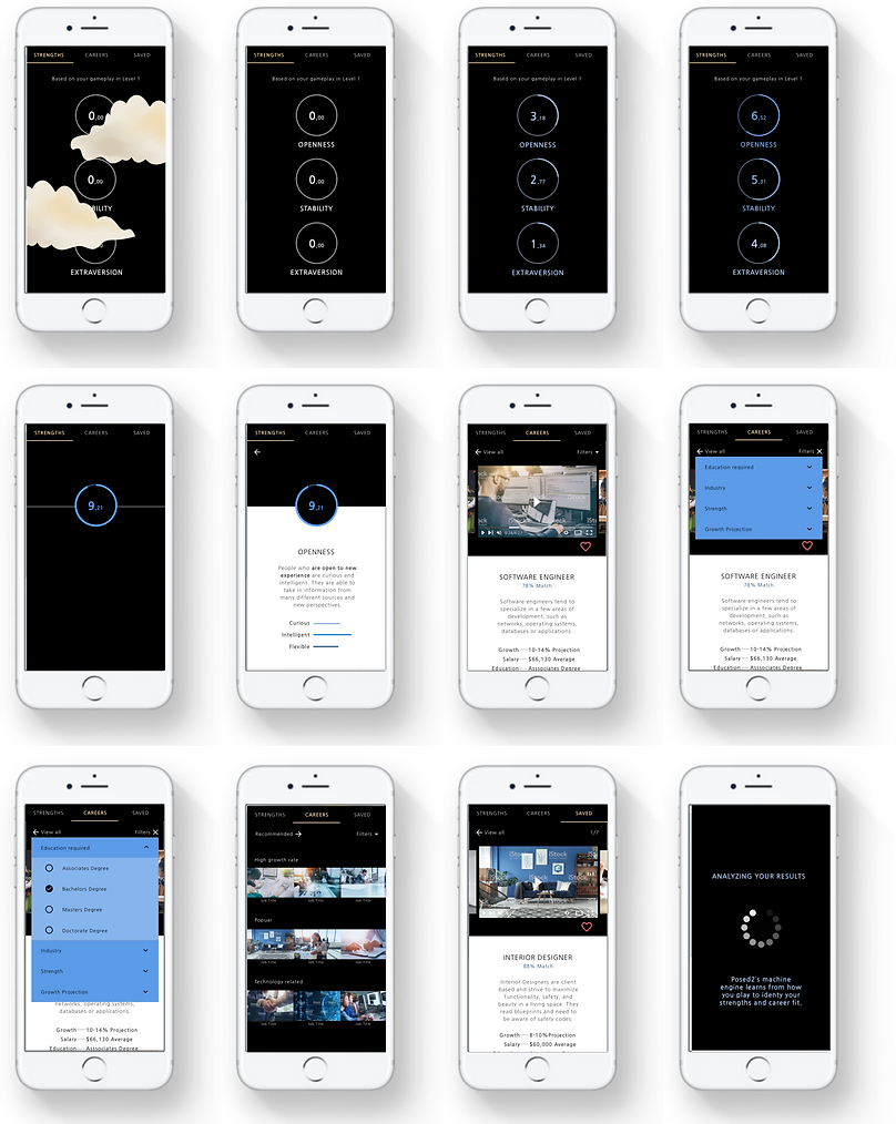
Integrate a 'loading screen' after game completion that explains Posed2's analysis process.
-
Add more interaction and use consistent graphics/styling as games throughout app.
-
Use videos, minimal text, and symbolism to communicate information.
Result
-
I will know that I have succeeded when users report:
-
Improved user self-report of trust in Posed2 and it's validity
-
Increased number of careers saved to user profiles
-
Increased user self-report that he/she found the app helpful in learning about personal strengths and career paths.
Design
11 KEYPATH SCENARIO
The user journey map describes Kimberly, the persona's, interaction with the Posed2 web app.

12 COLLABORATIVE DESIGN
Throughout the process, I worked closely with the development engineers, technical PM, and CEO. As a cross-functional team, we routinely dedicated meetings to exchange ideas for the designs that support product and business needs.
13 PAPER PROTOTYPES
In order to validate important product concepts and get early feedback, paper prototypes were used for usability tests. During this phase I specifically looked at app flow and deciphering which content user's found helpful.
In order to take time and budget constraints into account, I also tested specific features of other products with users. One example is testing League of Legends sign up process with users and replicating elements users responded well to.
14 MULTIPLE ROUNDS OF FEEDBACK AND ITERATION
Feedback from user testing with participants and Posed2 team members were gathered multiple times to ensure the design helps users attain their goal. The graphs below represent specific findings from user tests that I integrated into the final design.
15 ITERATIONS MADE BASED ON USER FEEDBACK
1) A few examples include changing the name of several the strengths such as 'agreeableness' to 'openness'. Users reported finding the words to be negative instead of a positive strength.
2) Presenting information that high school students found important when learning about potential careers in the career demographics.
3) Presenting only one career (or several for desktop version) at once. When testing with prototypes, presenting the user with 20 careers at once was found to be overwhelming and caused users to question the validity of the results.
4) The filter options for the careers were simplified and made more clear. For example, 'Education Level' was changed to 'Education Required' and filters such as 'STEM' were removed
16 LOW-FI USABILITY TEST FINDINGS
_p.png)


17 WIREFRAMES
A visual skeletal framework for the app was then created that integrated user and testing feedback in interface elements, navigation, and functionalities of the product.

18 COLOR SCHEME AND STYLE
Coloring and styling was carefully chosen from the pre-existing colors and graphics themes in the cognitive mini games. Replicating the cartoon-like style of the game was a challenge for me. I used the help of Nocky Dinh, visual and graphic designer, to create the vectors of the graphics. While the introduction of the app is colorful, I chose a dark background for the user dashboard to be consistent with the gaming theme.


Product
19 HIGH FIDELITY WIREFRAMES FOR RESULTS PAGES
20 INTERACTIVE PROTOTYPES
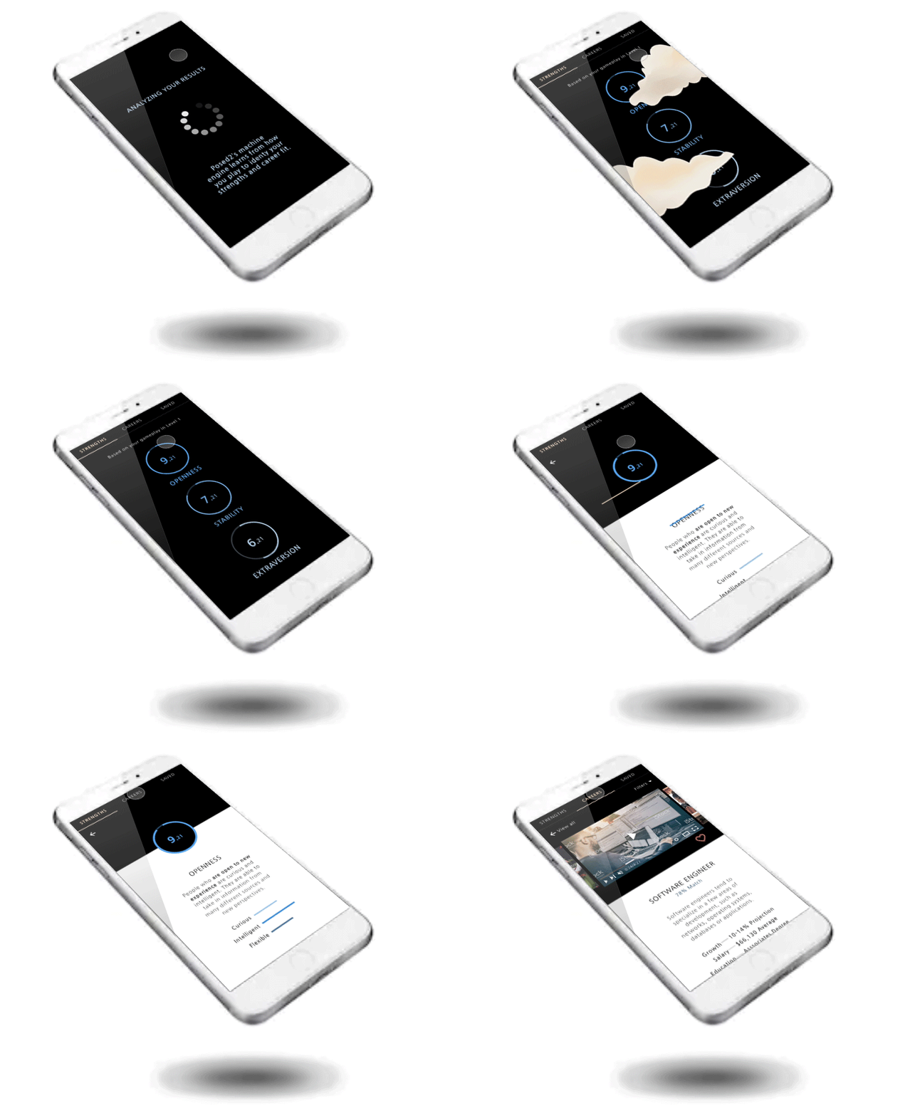
A high-fidelity interactive prototype was used to make conclusions about how users' behavior will relate to the use of the final product.
Retrospective
1. I learned the importance of communicating user research and its role in driving
design decisions and aligning a team.
2. I also learned about how I can utilize my background in psychology in UX design. In psychology, a recurring problem in a persons life is often seen as the result of a maladaptive behavior. A certain behavior that may have worked well in the past, with the person's family for example, may not be helpful or might even be harmful when that person repeats the same behavior in the present. However, the person may continue to repeat this behavior despite the outcomes because this is the only response he or she has been conditioned to have. It thus creates a mismatch between behaviors and expectations in the person's current context. The exact same concept exists in UX Design. In user research, a user's mental model, based on their past experience in accomplishing the given task, must be first understood so that the design can conform to current mental models. If matching the users' mental model isn't possible, then the design needs to at least accommodate for this change and inform the user at an earlier stage of the experience. Secondly, Just like in Maslov's hierarchy of needs, users can not focus on higher level aspirations until basic needs such as safety are met. I was surprised during this project to learn just how accurate this concept is within UX design. From our user interview synthesis, we found that concerns around trust with our start up company and around the use of their data was clear theme. Students reported that the these concerns would prevent them from using our app even when they were truly interested in the game.
3. Lastly, I learned how to be flexible with a tight budget and resources. During this project, I needed to constantly adapt and shift my designs based on fluctuations in budget and timing. Therefore, I had to keep goals in mind and know what design elements can be substituted for ones that are less expensive or time consuming. For example, for many of the animation effects we were able to take recordings of the animation from my prototype and play them as a looped video within the app instead of developing them from scratch. This saved a considerable amount of time while still having the same effect! Looking back, one aspect of my work that I would change is to create a design system and formalized component library. Once I understood the app and its future direction with multiple game levels, I would stress the importance of creating a design system to save time and effort for future developers, and eventually create a more consistent, frictionless user experience.